
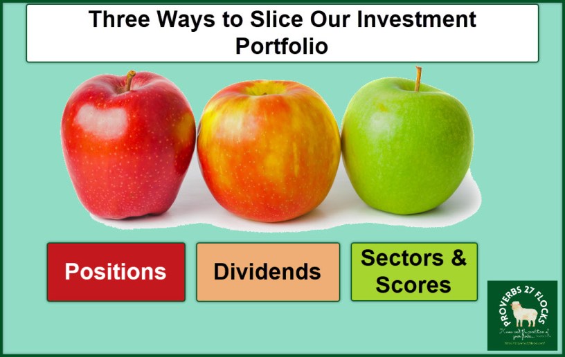
Three Ways to Slice the Portfolio

There are three primary ways I download information from Fidelity. Two of them are from the “Positions” portion of the Fidelity website. The third one, which contains some additional information, is from the Fidelity Active Trader Pro (ATP) application running on my laptop.
One of the Fidelity Investor Community members asked me for a spreadsheet of my positions. Because different investors have different needs and requirements, I created three spreadsheets. All three are available in my Public Dropbox folder, and I provide a link for each of them at the end of this blog post.
The Positions Spreadsheet

The file I download most frequently helps me determine where each position stands. I would like to know what the “top ten” are, and where I have more than $20,000 invested. Many of our positions have a value exceeding $20K, but I am reducing the number of positions I hold over time. I used to have far more than you will find in today’s spreadsheet. However, I do not recommend my approach for most investors. Most investors should probably stick to low-cost mutual funds, ETFs, and index funds.
The positions sheet is called: Portfolio_Positions_Dec-13-2022-BLOG-Update.xlsx
I removed columns from the download, but you can see the different accounts, the ticker symbols, a description of the holding, the number of shares in each position, the “percent of the account”, and the “Average Cost Basis.”
At the bottom of the spreadsheet I added some notes as follows:
1) All options positions were removed. However, the underlying stocks are in this list. 2) I do NOT recommend every investment in our portfolio. 3) Some positions are held for OPTIONS trading, not dividends. 4) DO NOT buy investments based on YIELD! 5) DO NOT buy investments you do not understand. 6) The “Percentage of Account” is unimportant. It is more important to consider all accounts. In other words, just because a position looks like it is over 5% it doesn’t mean it is 5% of our total holdings. That is just the percentage within that individual account.
The spreadsheet is set up with filters. Therefore, if you want to know how many shares of Ford we hold, click the Filter symbol at the top of column C and select Text Filters “Equals” F. The same logic works for all of my spreadsheets. You can also sort on any and all columns.

The Dividends Spreadsheet

The dividends spreadsheet (Portfolio_Positions_Dec-13-2022-BLOG-Dividends.xlsx) is a good source for dividend information for our positions. Again, I removed some columns for the public sharing of the data. However, you can see the Account Name, Ticker Symbol, a Description of the holding, the Share Quantity, the Percent Of Account, the Ex-Date for the dividend, the dividend amount per share, the dividend pay date, the dividend yield, and the estimated annual income based on the number of shares in each account.
I also added some colors to the rows. If the line is pink, then I cannot recommend it to an investor who is seeking the best investments. I buy some for speculative purposes and for options trading.

If the line is a light green, it is a position that will likely deliver at least $1,000 in dividends each year. Remember this is based on the number of shares held for the position. Forty-one of our positions fit that demographic.
In addition to filtering and sorting columns, you can also filter by the color. So, for example, you can filter the pink or green lines using the filtering dropdown. You can also sort using those filters. Use “Sort by Color” or “Filter by Color” as needed.
The Active Trader Pro Positions Spreadsheet
The ATP spreadsheet (ATP-POSITIONS-Dec-13-2022-BLOG.xlsx) has also been updated to remove some columns. Like the previous two, you can filter and sort as desired. This sheet includes columns for: the account, the ticker symbol, a description of the position, the purchase price (average cost), the earnings date, the dividend amount in dollars, the dividend date, the Ex-Dividend date, the dividend yield, the estimated annual income, the sector (or “ETF”), the industry group, and Fidelity’s equity summary score.
Column “K” has a total at the bottom. The EAI for all of our investments is currently at $159,644.88. Bear in mind that this changes frequently, and it is not a guarantee of income. It is estimated annual income based on the current dividend dollar amount and the frequency of the payment. Some investments pay quarterly, some pay monthly, and some pay nothing.
One of the benefits of this sheet is the ability to filter investments based on the sector and industry group. The following illustrates this with a focus on the energy sector.

Two Final Cautions
Because I trade options, what may look like a “loss” is not necessarily a true loss. It is true that some positions are worth less than I paid for them. However, by trading options, often the gain from the options trades far exceeds the paper loss. Furthermore, I am not compelled to sell something just because other investors don’t see the long-term potential for an investment.
Secondly, never, never, never buy an investment just because Wayne bought it. I have good reasons for what I buy and why I buy it. Unless you understand my reasons, you could buy an investment and lose a lot of money. I also have sell rules that may cause me to sell a position.
Here are the links to the three spreadsheets
LINK: Portfolio_Positions_Dec-13-2022-BLOG-Update.xlsx
