

Some Thoughtful Truths About Fund FFRHX
The “Fidelity® Floating Rate High Income Fund No Load” is a fund that is designed to provide monthly income. Recently, a member of the Fidelity Investor Community asked members for feedback regarding this fund. My response was brief and included an image, shown here. What I said was, “When I consider inflation and the expense ratio, I don’t see a compelling reason to own this investment.”
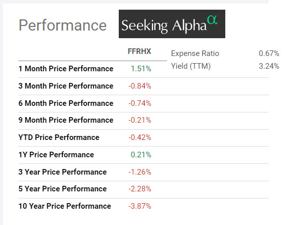
One member responded as follows. “Your data on FFRHX returns is grossly incorrect. You are showing negative returns over 3, 5 and 10 years, yet Fidelity … shows positive returns averaging about +3.5% annually over all of those time periods.” So whose data was incorrect?
The Devil in the Hypothetical Details
My college statistics professor used a phrase almost weekly in class. He said, “The figures never lie, but the liars always figure.” He was saying that we needed to look underneath the numbers to understand what they were telling us. It isn’t always a lie that is presented, but information can be presented in such a way that you draw the conclusion that the presenter wants you to believe. A graph or a table can be telling the truth and still be misleading. The devil in the details involves understanding the data and what is included, excluded, and assumed.
For example, a Fidelity graph can show that an investment has growth from $10,000 to $14,307 in ten years. This is only a true statement if you read the fine print. On the Fidelity website, the fine print on the graph in question says something very important about the data. “This measurement does not include fees, although it assumes the reinvestment of all dividend and capital gain distributions.” In other words, the graph is not reality. Furthermore, the title on the graph says, “Hypothetical Growth of $10,000.” Whenever you see “hypothetical” on a graph, remember what my college professor said. Here is the Fidelity graph showing what is hypothetical.


Furthermore, might I suggest that people buy income investments for income? Therefore, if you buy FFRHX for income, you may be spending the income. This means you are not reinvesting the dividends. Even if you are reinvesting, should you be satisfied with such paltry returns after ten years? I don’t believe the prudent, long-term investor, would accept a 40% return after ten years of investing. Your money should be worth at least 150% more after that period of time.
Evaluating the Data and the Graphs
It is true that Fidelity’s graph and data shows far better returns than the information I displayed from Seeking Alpha. However, if you read the reason for the “returns” you will find that it depends entirely on reinvesting the dividend. If you buy an investment for income, then I would conclude that you don’t intend to reinvest the dividend.
Here are several images to help in understanding this important aspect of the fund’s performance, including images from Fidelity and Seeking Alpha. Bear in mind that Seeking Alpha is not showing reinvested dividends, which is the way I prefer to see reality, especially for bond or other income funds.
Fidelity Total Annual Returns
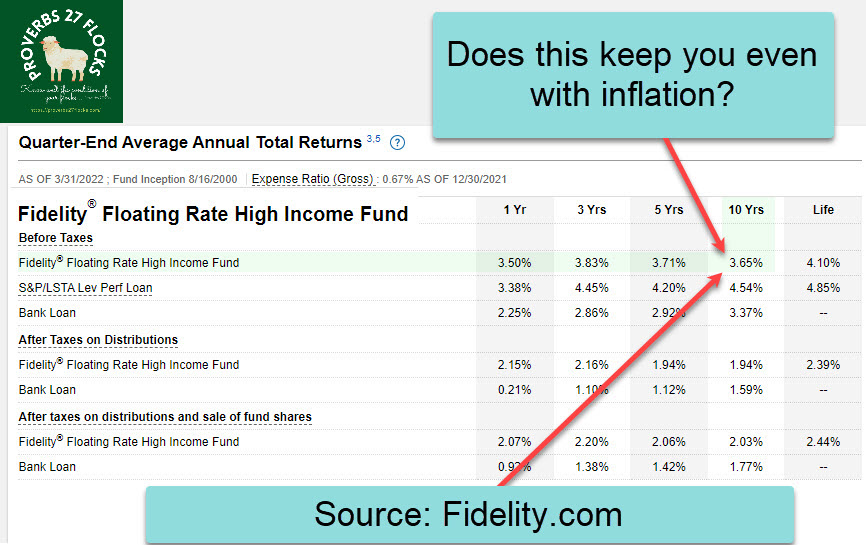
Annual total returns for the fund we are looking at are not acceptable from an inflation perspective. Don’t forget the daunting expense ratio. It is far too high to merit serious consideration.
Fidelity Prospectus

When you read a prospectus regarding a mutual fund, look for truth. A prospectus is a document describing the chief features of something, such as a business, or especially a stock offering or mutual fund, for prospective buyers or investors. If you look at the prospectus for FFRHX, you will find five-year numbers that declare the investment has gained zero ground in five years. What did inflation do to your $10,000 in five years. Gasp!
Seeking Alpha Dividends and Price History
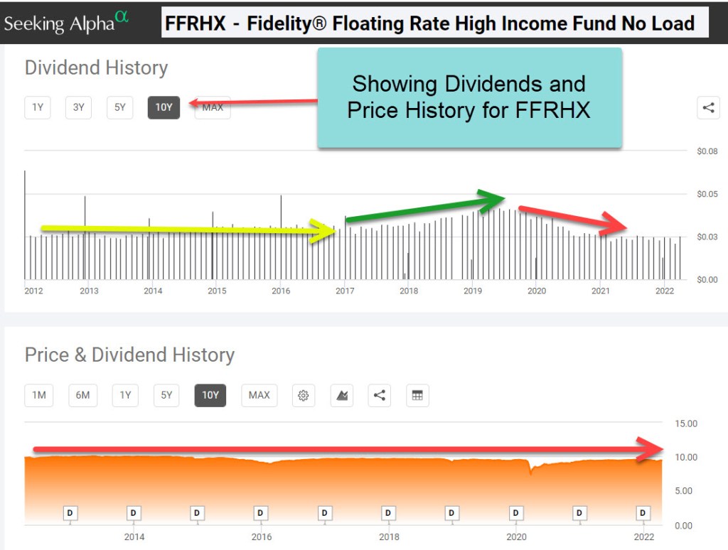
It is far easier to see reality when you look at the price history of an investment. This removes the “reinvesting the dividend” noise. There is nothing hypothetical in these graphs. Notice that income is not really growing. Furthermore, notice what the investment was worth ten years ago and what it is worth today. Yes, the Fidelity graph is “true” but it is truth with some varnish to make it prettier than it real is.
Conclusion
If you are a long-term investor, it is not wise to invest in a mutual fund or ETF that fails to keep you ahead of inflation. Therefore, most cash investments and income investments that focus on bonds will fail to deliver. Furthermore, and perhaps even more importantly, don’t read a graph or table as gospel. That, of course, also applies to graphs for good or great companies like Apple, Microsoft, Google, and Tesla.

I like to use Morningstar Premium to compare investments. The charts and portfolio comparisons include dividends and fees. Another words total return. Plus you can compare stocks etfs and mutual funds in one chart or portfolio. You can get Morningstar Premium for around $111/yr if you do a 3 year subscription with their special offer which always seems to be available. You can cancel anytime and get a prorated refund. I don’t have any connection to MS!
LikeLiked by 2 people
By the way you don’t have to have Morningstar Premium to do the charts and some portfolio analysis but I found it worth while for my analysis.
LikeLiked by 2 people